Thursday, 30 January 2014

Final products

Ancillary Task:

This is my final Music Magazine Advert. I have created 2 versions because I thought that it would be convenient for Korean readers if they could read in their own language and one in English for other magazines.


Ancillary task : 

This is my final  album digi-pack, I only created one as I didn't want my audience to be confused between the English version and the Korean. Therefore, I decided to put Korean translations on the track list instead. This will be convenient for the Korean Audience who are not familiar with the English language.


Mixbook - Create Beautiful Photo Books and Scrapbooks! | Start your own Photo Books | Create custom Christmas Cards
Music Video:

This is my final edit of my music video. I have follwed the majority of my audiences advice as they know what they want. Therefor I edited it the way they liked to ensure that I am meeting my audience's needs.

Storyline: Mi-Kyong has been engaged to a new man that she doesn't love. She hesitates to put her ring on as she knows that her wedding is right around the corner. She gets up from her previous position and walks inside the living room. But it isn't hers, it's her ex boyfriends. She sees the pictures above the fireplace and notices that he's happy with his new love. She picks up the frame one by one and she tries to re-live the times with him and how that used to be her in those pictures. But instead she's been replaced by someone else. She keeps trying to remember again and again but she can't. She finds herself lost in her own thoughts until she finally wakes up and realizes her reality is upon her and her past relationship is now just a distant memory.


Evalutation

Question 1

CD Album:


If unable to read please click on the link below -
http://www.mixbook.com/photo-books/interests/q1-cd-album-10239996?vk=9uCgwu59mE

Music Video:

If unable to read please click on the link below -
http://www.mixbook.com/photo-books/interests/q1-music-video-10253824?vk=mK4wXkUjgU

Magazine Advert:

If unable to read please click on the link below -
http://www.mixbook.com/photo-books/interests/q1-magazine-advert-10249770?vk=mK4wXkUjgU


Question 2


Media Evaluation question 2 - slideshow

Question 3


Question 4


Tuesday, 21 January 2014

Audience Feedback

While talking to my friend Matthew on skype I used my time to ask him questions about my work and what I he thought of my work, what he liked about it and what I could improve.
Matthew Li, 17, male :


Monday, 20 January 2014

Final draft - Music Video


This is my final draft of my music video. I have changed all of the requests and individual feedbacks from older drafts as well such as deleting the clip where she walks up the stairs as it's irrelevant and I have also added extra clips on the last third of the video to make up for the missing clips. I will ask a few of my audience for their feedback through social media such as skype, facebook and whatsapp.

After recieveing feedback from my peers I have decided to edit the final once more to decrease the blackness when she closes her eyes in the last quarter as the duration was too long therefore I slowed the speed of the clip where she closes her eyes to fill in the darkness.
This is the re-edited final:

Friday, 10 January 2014

Audience feedback

Over the Christmas half term I was able to show a majority of my target audience my products. I directly gave my blog URL to the majority of my friends and asked for their feed back. I asked for comments on my music video and someone left a comment on my two previous posts.


Twitter feedback:

@anzy :  I like the way you've got a simple story line and you've chosen good actors to star in your music video.

@Steezyahongza : The magazine advert is my favorite product. It stands out from the usual adverts I see.

@MaattLi : All three products are good and I can see they are all linked with each other.


This shows that the majority if not all of my target audience like my product its somethign they expect. My final step into finishing my products will be a final draft which will then lead me into making my final evaluations in different media forms.

Wednesday, 18 December 2013

Second edit of Magazine Advert


These are the three version I have created and in order to decide on my final design, I will be asking my audience through various online websites such as Facebook, Twitter, Instagram.


From the votes which I have recieved these were the outcomes:

Monday, 16 December 2013

Construction of music video: Draft 6


These are a few written feedbacks from a focus group. The majority of them liked the video so far but felt like the "walking" away scene is too long. From what I have learnt, I will need to edit and change a few of the chains of the video.

Changes I've made from the feedback I was given:


This is the first change I have made, I've learnt that the dramatic black pause was too long therefore I made the duration by half a second which now fills the black gap. I also showed down the first half of the frame as it went to quickly. I changed the clip speed to 60% which slowed it down.

From the feedback I received, I learnt that the majority of the audience disliked the walking away scene with the feet. So to tackle this problem, I deleted a few of the feet scenes and added a scene where she's looking at the clock. This now runs for 5 seconds. I also slowed down the duration of the clip where she's crying to decrease the walking away scene.

This was one of the most liked scene which shows a graphic match on the tea cups. However, the audience thought that the clip was too quick and wanted to see it more. To tackle this request, I increased the clips length which shows the rest of the clip to the audience. I have also increased the duration of the 2 images of the boys which shows them for a much longer time.


Friday, 13 December 2013

Album Digipak


This is my final Album digipak with the correct dimentions of a DVD template.

However I am still in the process of creating the photobook using Mixbook.com

Tuesday, 10 December 2013

Audience feedback on Album and Magazine Advert


Audience feedback - Kotryna from thatasiankim


From the feedback  I have received, I've learnt that they like the new design much better than the old one as it's visually appealing and the colour scheme is cool on the eyes and it also conveys the Korean genre much more than the old version. 

New Magazine Design

(Top row is the new design and bottom is the old one)

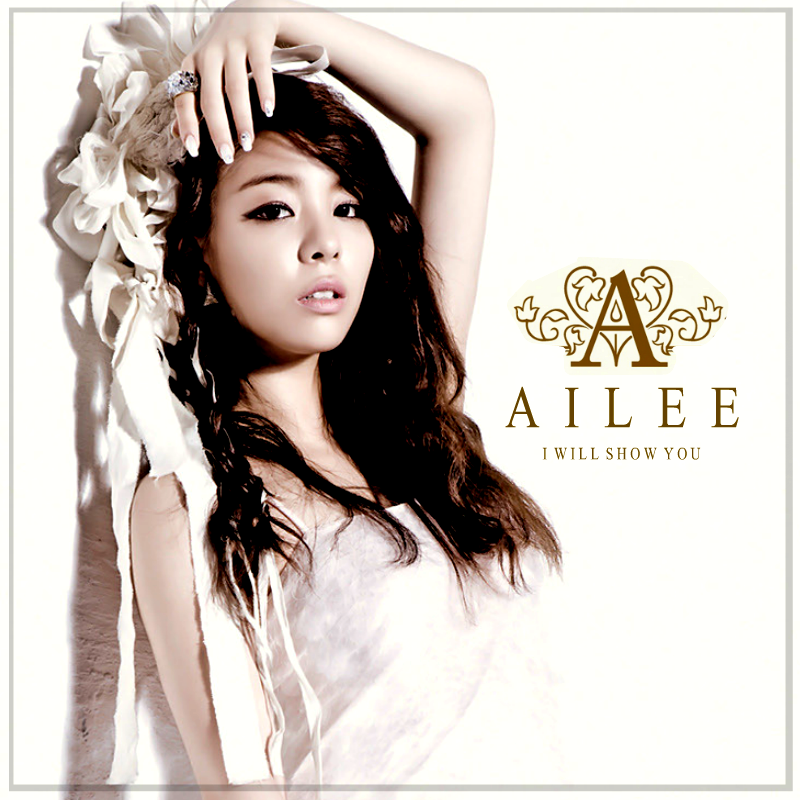
I have created a few changes from the old version such as the image I used. I used this image because she looks more visually appealing and direct mode of address is clearly presented. Continuation is easy to spot as I have used the same technique with the Album, the gradient is very clear here where they can instantly like the album and the music video. I have kept the availablility on Itunes and Google Play as I leanrt that the majority of my target audience liked that aspect from the old version, this is the same with the code scan. I kept the same font and style on the advert and the magazine to again show continuation and for the audience to distinguish the link between the two. The mise-en-scene is also very important here are we see Mi-Kyong in the same outfit which will be appealing and memorable in the audiences' minds.


New Album Design

These are some of the famous Korean albums which are from the female artists, they all have similarities such as the simple plain background, large artist name and a small album title.

I used these pictures as inspiration for my new album. I used the same techniques in Photoshop from what I've learnt previously.


The new technique I used to create the gradient effect. I created this effect by adding a rectangle object on a new layer above the image and then using the option to "Screen" it then I rasterized the layer which enabled me to edit it then used the gradient paint effect where I then picked the yellow and pink/coral colour to create an effect much like BOA's (bottom right) on the picture above.

I repeated these steps for the back cover as well as the spine. One of the most noticeable changes I have made was the images. For the front image, I kept the same image and enlarged it to fit the size of the album. I kept the same size as I think it is a good size for a Korean Album as they all come in different shapes and sizes. I also kept the font and texts I used however I changed the colour as i wanted it to stand out against the background, so I used the paint bucket tool and paint each letter.

This is the outcome of the old album vs the new :

The Front
 The Back
The Spine


Sudden Change - Album and Magazine advert

I have decided to recreate and improve my CD adlbum, this was beause I realised that my album didn't convay K-pop characteristcis. I believe that this new album is simililar and contain more characteristsics which will make my audience aare that it is a Korean album. I have kept the same font and font layout but I have however, changed the colours to make it stand out againt the plain background.

I have learnt that the majority of the Korean albums have a simple white background which my old album didn't contain and I learnt that my audience didn't recognise the genre as it didn't show enough conventions of a Korean album.

I will also be chaging a few things on my magazine advert as it didn't show enough continuation. One of the main problem is that the picture I used didn't show enough emotion and continuation as I picked a different picture which didn't show continuation in terms of mise-en-scene. I will also change the color of the text as it doesn't contract enough from the background, the audience were not able to see the text which may hinder the sales.

Tuesday, 3 December 2013

Construction of music video: Draft 5

"Your music video reminds me a little bit of Heaven by Ailee. If you added a filter to the videos and clips it would make it look more unique and have a sense of antique-ness to it" - Rhys Lam, 17.


This is the music video which Rhys was talking about and I believe by adding this similar effect to my music video my demographic will like it more.

From what I have learnt from all of my audience feedback they wanted a sense of Western aspects to it as well as Korean.

I used Adobe Premier Pro to add the filter and edit the music video again.

 
I added the filter using the 4 gradiant colour effect as I wanted the clips to have a varietion in terms of colour as I've learnt from Ailee's Music video, if I kept the beige colour by itself iy would look too dull which will put my audience off.


I have placed the colours is the corners of the side of the music video as I wanted a colour effect to it. The colour I have chosen to use are white and orange/beige. This was because from previous research orange and white blends together to make a hazey and romantic effect. This is evident in Ailee's music video and it's a convention I wish to follow.
 
 
As I've stated in previous posts, I would change the title colour to black. This is because I wanted a sense of "disturbance" to my music video and the black text which is contrasting againt the white may forshadow the narrative of the music video. I have added a white shadow to the title so that the title isn't too black washed which may turn away my demographic.
I have also increased the title duration to 3.5 seconds as from my previous audience research I learnt that the title was too quick for the audience to read.
 
I also added two graphic matches on the tea scenes as some of my audience didn't link the teas to the male characters. I thought that by adding the male characters images it would sign post it to the audience.
 
 Firstly I edited the image of the guys through photoshop. I used the eraser tool which took off the background colour, then I shaped the image by layering the image of the tea cup and erasing the sides to fit the shape. I then exported it as a video so Adobe Premier Pro will allow me to import it then I added video transitions such as fade and gradients.
 
This is the final video

Wednesday, 13 November 2013

Updates on the products

Music Video - Main Task
 
 
Music Video Narrative explained
 
Mi-Kyong has been engaged to a new man that she doesn't love. She hesitates to put her ring on as she knows that her wedding is right around the corner. She gets up from her previous position and walks inside the living room. But it isn't hers, it's her ex boyfriends. She sees the pictures above the fireplace and notices that he's happy with his new love. She picks up the frame one by one and she tries to re-live the times with him and how that used to be her in those pictures. But instead she's been replaced by someone else. She keeps trying to remember again and again but she can't. She finds herself lost in her own thoughts until she finally wakes up and realizes her reality is upon her and her past relationship is now just a distant memory. 
 
Magazine Advert (Korean and English) - Ancillary Task


CD Album (including the CD) - Ancillary Task


Tuesday, 12 November 2013

Mise-en-scene | Sound | Camera | Editing

I'm going to explain why I have used the camera shots, angles, movements, editing, mise-en-scene and sound  by the use of some screen shots from my music video.
 
This is one of the clips in the beginning. A close up was used to show and express her facial expression to the audience, on the other hand, I focused the camera on the vine. This was done to make the audience more intrigued with the artist. The close up also enables the audience to focus their attention the mise-en-scene. It's evident that she is wearing a white top which connotes innocence and this is again backed up with the depth of focus. Lighting is a key aspect of this shot, the natural lighting of the sun is mainly hitting the left side of her face and a dark shadow is casted on the right this may connote her thoughts and her character.
 
 
I used a high angle here to express her innocence, she is situated in the shadow of the sun which may foreshadow that her future isn't bright. There is also a red blanket beneath her which may symbolise danger which is approaching. I used a zoom effect to emphasis her innocence and danger. This will allow the audience to feel sorry for her. Another way in which the audience can tell that something is wrong is through her posture and body language, she is slouching therefore she must have received bad news.

 
This  is a very simple but effective clips which a lot of my audience liked. It shows one of the tea cups being filled while the other has been left empty. The reason behind this shot is to show symbolism, it follows the narrative of the story and how Mi-kyong is going to get married to another man that she doesn't love. I have simply showed this through the left cup which is empty which connotes her feelings towards him. The right cup which is being filled connotes her feelings for her ex-boyfriend Sam and how she still loves him. The dim lighting adds a very good effect which empathises the colour of the tea (her feelings). I used a mid shot to show the two tea cups and the tea pot. This has a great impact on the audience as they will start to wonder why there's clips of the tea scene.

 
The use of tilting on this scene adds a good effect as I was able to express her real feelings. as the tilt gets closer to the end the audience are able to see some of the steam which connotes that her feelings towards her ex-boyfriend, Sam is still there and still alive. The extreme close up allows the audience to clearly analyse the cup.

 
I used a cut as one of the main editing techniques which shows continuation, this is the slow motion ring scene which I have slowed down to empathises it's importance to the audience. It situated on the bottom right of the rule of thirds intersection this may reflect on the physical relationship of the couple which shows that's its on the edge and may connote that it's imbalanced.


 The composition of this shot is very important in order to make the audience feel sorry for her. She is located on the middle third which siginifies her importance. The direct mode of address is eveident due to her looking straigt at the audience which will show her emotions. The redness of the lipstick contrasts againts the whole of the mise-en-scene which may connote love and passion, this may link with her feeling towards Sam (Ex-bofriend). The camera is potisioned at a high angle which shows that she's vulerable and highlights her innocence.
 
 
The low angle of the clock siginifies the importance of time, it's also an important clip in the narrative as it shows that she's running out of time. The two prints of the world within the clock may symbolise the two guys in her life, one she loves but can't be with and the one she has to marry but doesn't love.