Showing posts with label Ancillary task (CD Album). Show all posts

Thursday, 30 January 2014

Final products

Ancillary Task:

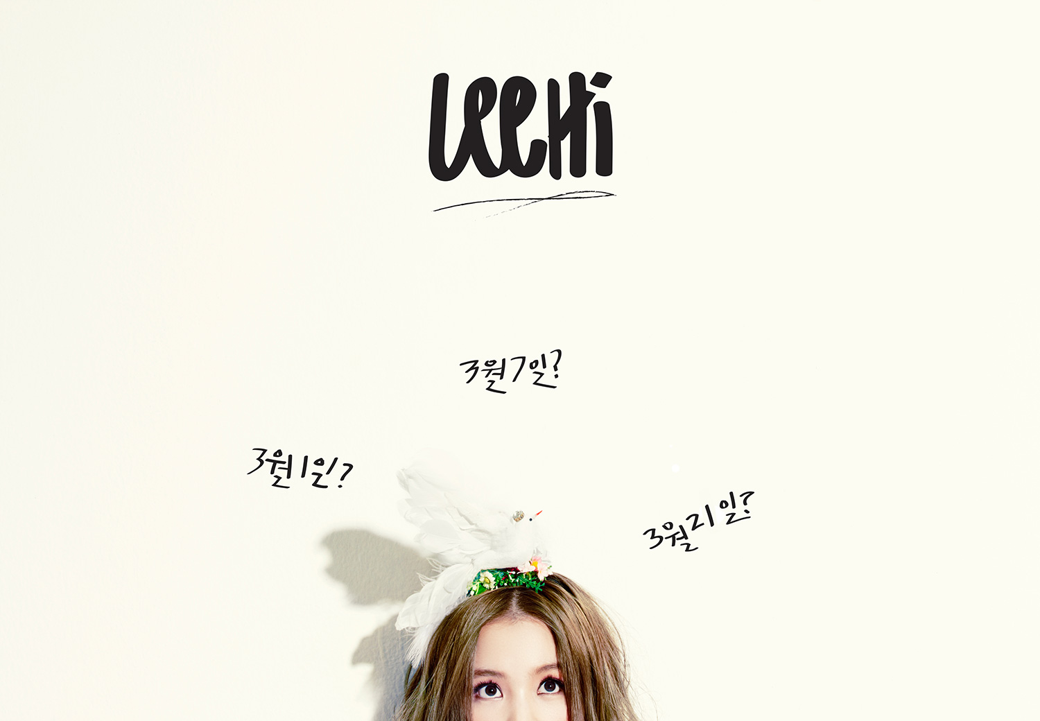
This is my final Music Magazine Advert. I have created 2 versions because I thought that it would be convenient for Korean readers if they could read in their own language and one in English for other magazines.


Ancillary task : 

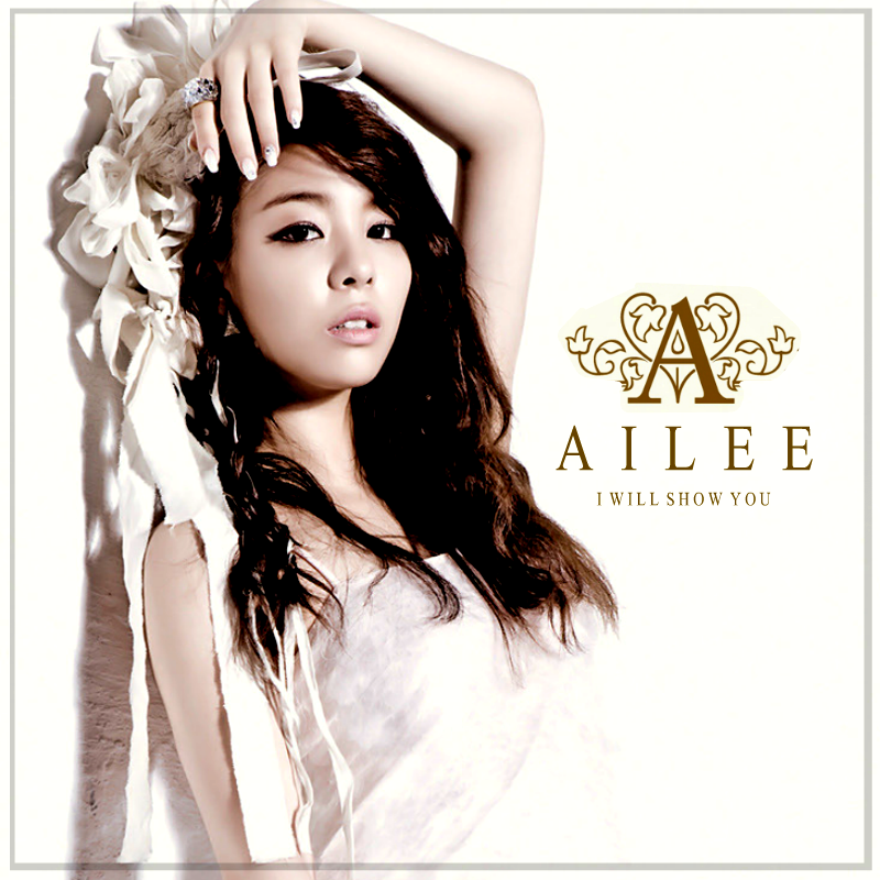
This is my final  album digi-pack, I only created one as I didn't want my audience to be confused between the English version and the Korean. Therefore, I decided to put Korean translations on the track list instead. This will be convenient for the Korean Audience who are not familiar with the English language.


Mixbook - Create Beautiful Photo Books and Scrapbooks! | Start your own Photo Books | Create custom Christmas Cards
Music Video:

This is my final edit of my music video. I have follwed the majority of my audiences advice as they know what they want. Therefor I edited it the way they liked to ensure that I am meeting my audience's needs.

Storyline: Mi-Kyong has been engaged to a new man that she doesn't love. She hesitates to put her ring on as she knows that her wedding is right around the corner. She gets up from her previous position and walks inside the living room. But it isn't hers, it's her ex boyfriends. She sees the pictures above the fireplace and notices that he's happy with his new love. She picks up the frame one by one and she tries to re-live the times with him and how that used to be her in those pictures. But instead she's been replaced by someone else. She keeps trying to remember again and again but she can't. She finds herself lost in her own thoughts until she finally wakes up and realizes her reality is upon her and her past relationship is now just a distant memory.


Friday, 10 January 2014

Audience feedback

Over the Christmas half term I was able to show a majority of my target audience my products. I directly gave my blog URL to the majority of my friends and asked for their feed back. I asked for comments on my music video and someone left a comment on my two previous posts.


Twitter feedback:

@anzy :  I like the way you've got a simple story line and you've chosen good actors to star in your music video.

@Steezyahongza : The magazine advert is my favorite product. It stands out from the usual adverts I see.

@MaattLi : All three products are good and I can see they are all linked with each other.


This shows that the majority if not all of my target audience like my product its somethign they expect. My final step into finishing my products will be a final draft which will then lead me into making my final evaluations in different media forms.

Friday, 13 December 2013

Album Digipak


This is my final Album digipak with the correct dimentions of a DVD template.

However I am still in the process of creating the photobook using Mixbook.com

Tuesday, 10 December 2013

Audience feedback on Album and Magazine Advert


Audience feedback - Kotryna from thatasiankim


From the feedback  I have received, I've learnt that they like the new design much better than the old one as it's visually appealing and the colour scheme is cool on the eyes and it also conveys the Korean genre much more than the old version. 

New Album Design

These are some of the famous Korean albums which are from the female artists, they all have similarities such as the simple plain background, large artist name and a small album title.

I used these pictures as inspiration for my new album. I used the same techniques in Photoshop from what I've learnt previously.


The new technique I used to create the gradient effect. I created this effect by adding a rectangle object on a new layer above the image and then using the option to "Screen" it then I rasterized the layer which enabled me to edit it then used the gradient paint effect where I then picked the yellow and pink/coral colour to create an effect much like BOA's (bottom right) on the picture above.

I repeated these steps for the back cover as well as the spine. One of the most noticeable changes I have made was the images. For the front image, I kept the same image and enlarged it to fit the size of the album. I kept the same size as I think it is a good size for a Korean Album as they all come in different shapes and sizes. I also kept the font and texts I used however I changed the colour as i wanted it to stand out against the background, so I used the paint bucket tool and paint each letter.

This is the outcome of the old album vs the new :

The Front
 The Back
The Spine


Sudden Change - Album and Magazine advert

I have decided to recreate and improve my CD adlbum, this was beause I realised that my album didn't convay K-pop characteristcis. I believe that this new album is simililar and contain more characteristsics which will make my audience aare that it is a Korean album. I have kept the same font and font layout but I have however, changed the colours to make it stand out againt the plain background.

I have learnt that the majority of the Korean albums have a simple white background which my old album didn't contain and I learnt that my audience didn't recognise the genre as it didn't show enough conventions of a Korean album.

I will also be chaging a few things on my magazine advert as it didn't show enough continuation. One of the main problem is that the picture I used didn't show enough emotion and continuation as I picked a different picture which didn't show continuation in terms of mise-en-scene. I will also change the color of the text as it doesn't contract enough from the background, the audience were not able to see the text which may hinder the sales.

Wednesday, 13 November 2013

Updates on the products

Music Video - Main Task
 
 
Music Video Narrative explained
 
Mi-Kyong has been engaged to a new man that she doesn't love. She hesitates to put her ring on as she knows that her wedding is right around the corner. She gets up from her previous position and walks inside the living room. But it isn't hers, it's her ex boyfriends. She sees the pictures above the fireplace and notices that he's happy with his new love. She picks up the frame one by one and she tries to re-live the times with him and how that used to be her in those pictures. But instead she's been replaced by someone else. She keeps trying to remember again and again but she can't. She finds herself lost in her own thoughts until she finally wakes up and realizes her reality is upon her and her past relationship is now just a distant memory. 
 
Magazine Advert (Korean and English) - Ancillary Task


CD Album (including the CD) - Ancillary Task


Monday, 21 October 2013

Photobook for the CD Album

Kpop albums usually come with a Photobook. A photobook is simply a collection of images in a book which comes with the Album. The images are taken from the music video and/or a photoshoot in relation to the music video and album.


This is an example of a photobook from BOA's music album Only One. As you can see the images vary from black and white to color.

I have made a similar style to follow the conventions of a photo-book Korean style. I used the same techniques I obtained from the music CD album. Nevertheless, I have decided to make my photos smaller than the example as I want mine to fit inside the CD.


Tuesday, 15 October 2013

Planning the Album


This is a collection of Korean Pop albums and it's evident that they do not follow the uniform square thus I shall follow this convention.  It's also usual to see that some albums are just artwork for example U-Kiss and EXO. It's something which is common to see, though pictures of the artist/group is also common to see or a mash-up picture to create a unique cover for example Shinee's Dream Girl album.

Conventions of the front cover which I will try follow:
* A simple picture of the artist/band OR a simple artwork
* The name of the artist/group
* The name of the album
* The record company lable


Conventions of the back cover which I will try to follow: 
* A simple colour for the background
* The picture of the artist/group but the pose is different from the front cover
* The list of songs
* Simple font so that it's easy to use
* The logo of the record company
* A few text details

Conventions of the Spine:
* Easy and readable font
* Logo of the artist/band
* Name of the group/artist
* Same colour as the main cover

~ ~ ~ ~ ~ 


This is my first idea. I wanted to have a vintage oval frame where the image of my artist  would be I was inspired my Girls Generation’s The Boys Album. I wanted my artists to portray class and elegance. The swirls will be a new layer with a texture which I imagine would look good. Another aspect of the album I wanted to incorporate into my own was the colour scheme. The baby pink, blue and silver-y grey all together looks great. On the other hand, the quick sketch  I have done does look a little bit boring which is why I need to add something to it that would make it unique and different.

This is my second idea. I plan to have a cherry blossom tree branch on the side to connote love and also to link it with the traditional Korean Culture. I kept the oval frame as I like it and I think that it would look good with the floral layer. The image that I will choose for the frame will have to either contrast or combine with the rest of the album. If I choose a contrasting image then I will need to make the rest of the colour of the album the opposite colour to make my artist stand out. 

This is my second idea and the oval frame has been enlarged as I want my artist to be seen and also grab the fans eyes. However, I feel that the design is too simple and plain for my liking. I don't think that I will be using this as it doesn't attract me let alone the target audience.


~ ~ ~ ~ 

Final Ideas 

I have come up with the conclusion that I will use my second idea as I believe a lot of people will like it. 


I have decided to use earthy colours to connote love and to go with the season. I think my by subverting the characteristics of the genre, it would make my product stand out against the rest of the albums out in the market. Furthermore, I used these colours as they are similar to the magazine advert and this would show continuation and the audience will be able to link it together.

I will also be using 3 images for the whole case of the album and there are: 


I chose this picture as the front image for the album as it looks nice, the direct mode of address is evident. Her body language conveys a shy yet forward. Her hand gesture shows elegance and how careful she is when putting her earring on. Her mouth is slightly parted therefore emitting her sexual appeal which will entice the male demographic.

This will be the one of the two pictures for the back cover. Her eyes shows a pleading yet innocent look within them which will show her naive side which will link with the songs on the album.


This will be the other image for the back cover and I like this image as it shows her confident side. Her hair falls wonderfully on her shoulders which shows her feminine side and again she's making direct eye contact. 

Tuesday, 17 September 2013

Audience feedback: Ancillary Task - Magazine Advert

This is a very simple and straightforward questionnaire which I gave out to my target audience. Specifically didn't say what the first set of images was for as I wanted their honest opinion. On the other hand they may link it to the sketches I have create below. I asked 10 people both genders and here are the results:

4 of the male audience chose the same image and that was the middle picture where she is looking at on the left. But one of the male audience chose the first image and when I asked him why he chose it he stated "I think she gives a powerful vibe to the audience by the way she's standing" I do agree that her posture in that image portrays his statement.
3 of the female audience chose the middle image and I all asked why and they all had a common answer of "she looks so beautiful" and this shows that the artists appeal to the audience is sometimes through beauty. The other two chose the one on the far left and they stated that she looks "very innocent and cute" but this is not what I am trying to portray so I will not be using that image.

For the layout there was almost a split decision where 9 people voted for the middle image with the title of the album on the bottom and the artists name at the top and 11 people chose the far right image. I asked the first person to choose the far right ans they said that they liked the composition of the title and name and it looks nicer than the rest but another person argued and stated that layout on the middle looks nicer and the name of the artists should always come first.

After evaluating my audience's feedback I have decided to create a simple plan of what I have gathered from the information they have given me and this is what I've made: