These are the three version I have created and in order to decide on my final design, I will be asking my audience through various online websites such as Facebook, Twitter, Instagram.
From the votes which I have recieved these were the outcomes:
These are a few written feedbacks from a focus group. The majority of them liked the video so far but felt like the "walking" away scene is too long. From what I have learnt, I will need to edit and change a few of the chains of the video.
Changes I've made from the feedback I was given:
This is the first change I have made, I've learnt that the dramatic black pause was too long therefore I made the duration by half a second which now fills the black gap. I also showed down the first half of the frame as it went to quickly. I changed the clip speed to 60% which slowed it down.
From the feedback I received, I learnt that the majority of the audience disliked the walking away scene with the feet. So to tackle this problem, I deleted a few of the feet scenes and added a scene where she's looking at the clock. This now runs for 5 seconds. I also slowed down the duration of the clip where she's crying to decrease the walking away scene.
This was one of the most liked scene which shows a graphic match on the tea cups. However, the audience thought that the clip was too quick and wanted to see it more. To tackle this request, I increased the clips length which shows the rest of the clip to the audience. I have also increased the duration of the 2 images of the boys which shows them for a much longer time.
From the feedback I have received, I've learnt that they like the new design much better than the old one as it's visually appealing and the colour scheme is cool on the eyes and it also conveys the Korean genre much more than the old version.
(Top row is the new design and bottom is the old one)
I have created a few changes from the old version such as the image I used. I used this image because she looks more visually appealing and direct mode of address is clearly presented. Continuation is easy to spot as I have used the same technique with the Album, the gradient is very clear here where they can instantly like the album and the music video. I have kept the availablility on Itunes and Google Play as I leanrt that the majority of my target audience liked that aspect from the old version, this is the same with the code scan. I kept the same font and style on the advert and the magazine to again show continuation and for the audience to distinguish the link between the two. The mise-en-scene is also very important here are we see Mi-Kyong in the same outfit which will be appealing and memorable in the audiences' minds.
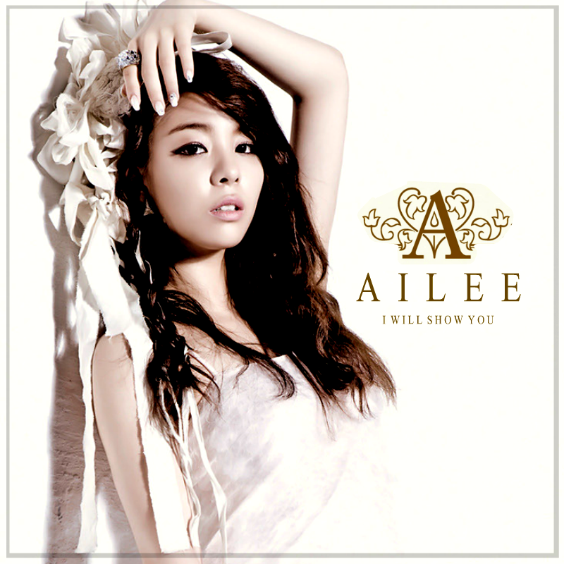
These are some of the famous Korean albums which are from the female artists, they all have similarities such as the simple plain background, large artist name and a small album title.
I used these pictures as inspiration for my new album. I used the same techniques in Photoshop from what I've learnt previously.
The new technique I used to create the gradient effect. I created this effect by adding a rectangle object on a new layer above the image and then using the option to "Screen" it then I rasterized the layer which enabled me to edit it then used the gradient paint effect where I then picked the yellow and pink/coral colour to create an effect much like BOA's (bottom right) on the picture above.
I repeated these steps for the back cover as well as the spine. One of the most noticeable changes I have made was the images. For the front image, I kept the same image and enlarged it to fit the size of the album. I kept the same size as I think it is a good size for a Korean Album as they all come in different shapes and sizes. I also kept the font and texts I used however I changed the colour as i wanted it to stand out against the background, so I used the paint bucket tool and paint each letter.
I have decided to recreate and improve my CD adlbum, this was beause I realised that my album didn't convay K-pop characteristcis. I believe that this new album is simililar and contain more characteristsics which will make my audience aare that it is a Korean album. I have kept the same font and font layout but I have however, changed the colours to make it stand out againt the plain background.
I have learnt that the majority of the Korean albums have a simple white background which my old album didn't contain and I learnt that my audience didn't recognise the genre as it didn't show enough conventions of a Korean album.
I will also be chaging a few things on my magazine advert as it didn't show enough continuation. One of the main problem is that the picture I used didn't show enough emotion and continuation as I picked a different picture which didn't show continuation in terms of mise-en-scene. I will also change the color of the text as it doesn't contract enough from the background, the audience were not able to see the text which may hinder the sales.


+Thanx+to+fernando.png)